Thursday, January 31, 2008

The Best Pens for the Money!


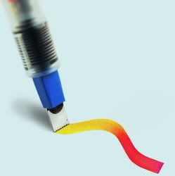
I can't say enough good things about the Pilot Parallel pens. Instead of having a split nib typical of most calligraphy pens, the Parallel pens have two flat parallel (hence the name) plates through which the ink is put on paper. The different sizes are usually sold separately, unless you can find a dealer who sells them as a group. The price for each pen usually runs between $14 and $18 US, depending on the dealer.

They come in four sizes of nibs: 1.5, 2.4, 3.8, and 6.0 mm. Each pen comes with a black and a red ink cartridge and an ink bladder. There are 12 available ink colors, and the colors are rich and flow well from the pen. The black ink is a nice solid black, not like a grayish, washed-out black you get with many cartridge pens. The other colors are just as vivid.

The first time I used a Parallel pen, I was in Heaven. The nib travels over the paper with almost no effort, and without all of the skips, bumps, and jagged edges that are typical of a lot of pens. It feels almost like writing on the smoothest piece of ice. And everyone I show this pen to "oohs" and "aahs" over how easy it is to use and how beautiful the results are.

Another feature that I love about this pen is that the ink is mixable. If you fill two pens with two different colors of ink and touch the nibs together, you can do all kinds of fantastic stuff. Experiment to your heart's content! This is only the beginning:

 
I hadn't found an affordable, GOOD cartridge pen until I bought my first Pilot Parallel. Of course, I still use my pencils and calligraphy markers for practice, but I only do my professional work with my Parallel pens, the best pens on the market!

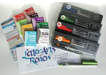
Photos from John Neal Books and Schrader Kunst & Hobby respectively. 

Wednesday, January 30, 2008

Practice, practice, practice!

If you are a beginner at ornamental handwriting, you don't need to run out and buy the most expensive pens and papers. Even the most seasoned calligraphers practice, practice, practice! Calligraphy is just like a sport, and if you don't practice, you lose your technique.

For me, the best practice tools can be found anywhere. I'm talking about a plain 'ole pencil and notebook paper, graph paper, or a primary school writing tablet. Using a pencil when you are first starting out will help you focus on how to make the strokes of each letter, without having to worry about anything else. Personally, when I'm learning a new font, I take my pencil and just practice the strokes for each alphabet. And no, my letters are usually not pretty when I am first learning. You have to train your hand to move a certain way. Calligraphy is not like your regular, everyday handwriting.

If you study the alphabet you want to learn, you will see that there are actually very few strokes that, when combined, make up every letter in that style of alphabet. Practice doing those strokes many times until you feel comfortable enough to form letters. Also study letter families (a, d, g, q and h, m, n, r, etc) and try to recognize the basic strokes that go into forming each letter. Check out this resource on learning the Italic style as an example: Italic Handwriting Lesson. Italic is great for beginners because it is very basic, but as you become more adept at letter formation, you can add fancy flourishes.

When I feel comfortable enough with the basic strokes and can form each letter with some confidence, I move on to using a calligraphy marker. There are many such markers on the market, and they come in a wide variety of colors, widths, and styles. Check your local hobby store in the art section. Of course, as with any marker, the tips will become fuzzy and start to spread. But remember, this is just for practice.

Practice as much as you can, and don't worry if the letters don't look exactly like the model alphabet. You will develop your own style in no time! It just takes practice!


Monday, January 28, 2008

Book Review

Mastering Copperplate Calligraphy: A Step-by-Step Manual
By Eleanor Winters
Copyright 1989 by Dover Publications
ISBN: 978-0486409511

This book is a must-have for any calligrapher's library. Copperplate is one of the harder handwriting styles to master, but Eleanor Winters breaks the font down into easily manageable pieces. As with any good style manual, a historical discussion of the font is included to introduce students to this beautiful style. Each letter and letter family is further broken down, with ample dissection of and explanation on creating each letter of the alphabet. Winters even includes examples of "badly formed" letters and explains why they are bad.

Every time I read this book, I learn something new. This is the only Copperplate manual you need, whether you want to just dabble in or master the art of this gorgeous writing style.


Thursday, January 24, 2008

I finally have a website!

Although it's not a professional website, designed by someone who charges big bucks, it's still my little piece of the internet to share my passion for calligraphy. 

I hope soon to have a few samples, a price list, and I will be working on a brochure. 

***Please Note*** As I build this site, there may be times where a link doesn't have anything to actually look at. This will refer mostly to samples of my work and font styles. I will do the best I can to get everything created and/or scanned as quickly as possible. Thank you for your patience! And thanks for visiting!